Fresh, nature-inspired greens—tailored for light, privacy, and real-life Colorado living
Green is having a strong moment in interiors, but spring in Colorado calls for a smart version of the trend: hues that feel grounded, fabrics that handle bright sun, and window treatments that make your rooms more comfortable as daylight stretches longer. Whether you’re a homeowner refreshing one room or a designer specifying finishes for a full project, the right green at the window can read calm, crisp, and timeless—without overpowering your furnishings.
Why green works so well in window treatments (especially in spring)
Green is flexible: it can behave like a neutral (think olive, eucalyptus, moss) or become a focal point (pistachio-chartreuse, teal, saturated leaf tones). At the window, that flexibility matters because daylight changes color perception hour by hour. A green shade or drape can:
• Soften harsh light while keeping rooms bright and inviting
• Add “biophilic” character—an easy visual connection to the outdoors
• Pair beautifully with popular spring materials: warm woods, linen textures, stone, and woven accents
• Bring seasonal color into a space without committing to paint
Spring 2026 green hues designers are leaning into
The green story has shifted from one-note “all sage, all the time” to layered, earthy, and slightly warmer greens—plus a few playful brights for accent moments.
Pro tip: if you’re nervous about “too much green,” start with an olive or eucalyptus that reads like a neutral from across the room—then add depth with trim, banding, or a coordinating tape.
Choosing the right green by treatment type
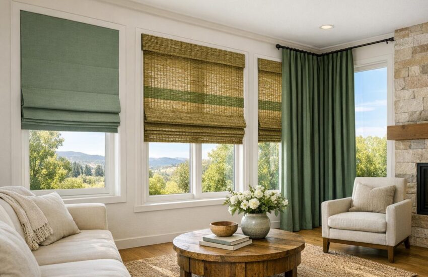
1) Roman shades (structured, design-forward)
Romans are ideal for showcasing a nuanced green—especially textured solids, small-scale patterns, or a subtle herringbone. If you want spring freshness without “neon,” aim for eucalyptus, celadon, or a softened pistachio. For a more architectural look, add a clean banding detail at the bottom edge.
Romans are ideal for showcasing a nuanced green—especially textured solids, small-scale patterns, or a subtle herringbone. If you want spring freshness without “neon,” aim for eucalyptus, celadon, or a softened pistachio. For a more architectural look, add a clean banding detail at the bottom edge.
2) Solar & roller shades (quiet, high-performance)
For Colorado’s bright spring sun, solar shades are a favorite because they reduce glare and help protect interiors while keeping a clean, minimal profile. Olive, moss, and warm gray-green look sophisticated in modern homes and commercial spaces alike—especially when paired with crisp trim and simple hardware.
For Colorado’s bright spring sun, solar shades are a favorite because they reduce glare and help protect interiors while keeping a clean, minimal profile. Olive, moss, and warm gray-green look sophisticated in modern homes and commercial spaces alike—especially when paired with crisp trim and simple hardware.
3) Woven wood shades (natural texture that makes green feel effortless)
If “green window treatments” to you means eco-leaning, biophilic style, woven woods are a natural match—especially in spring décor. You can keep the shade itself neutral and introduce green through edge banding or drapery panels, or go fully botanical with a green-tinted weave for a relaxed, organic look.
If “green window treatments” to you means eco-leaning, biophilic style, woven woods are a natural match—especially in spring décor. You can keep the shade itself neutral and introduce green through edge banding or drapery panels, or go fully botanical with a green-tinted weave for a relaxed, organic look.
4) Drapery (the best place for deep, dimensional greens)
Want a “wow” moment? Drapery in forest, olive, or teal can add depth instantly—especially with a lining that improves light control and helps the fabric hang beautifully. Linen blends read casual and bright for spring; velvets and heavy textures feel dramatic (and can be excellent for bedrooms or media rooms).
Want a “wow” moment? Drapery in forest, olive, or teal can add depth instantly—especially with a lining that improves light control and helps the fabric hang beautifully. Linen blends read casual and bright for spring; velvets and heavy textures feel dramatic (and can be excellent for bedrooms or media rooms).
5) Blinds & shutters (where green shows up through coordination)
If your home is better served by blinds or shutters for everyday control, you can still do the green trend beautifully: keep the hard treatment classic (white, warm white, or wood tones) and layer green through side panels, valances, or upholstery accents to keep the look seasonal and easy to update.
If your home is better served by blinds or shutters for everyday control, you can still do the green trend beautifully: keep the hard treatment classic (white, warm white, or wood tones) and layer green through side panels, valances, or upholstery accents to keep the look seasonal and easy to update.
Did you know? Quick green-at-the-window facts
• Texture changes the color. A slubby linen makes green look softer and more organic; a smooth сатen-like weave reads cleaner and brighter.
• Lining is a “color control” tool. The right lining can keep a vivid green from looking washed out in strong daylight.
• Undertones matter more than the name. Two “sage” fabrics can look completely different—one cool and silvery, one warm and earthy—once they’re up at the window.
• Green plays well with spring neutrals. It’s especially comfortable with warm whites, mushroom/taupe, and natural wood tones that remain popular for a reason: they’re forgiving and livable.
A practical “green window treatments” checklist
Use this when you’re narrowing fabrics and finishes:
Light direction: North-facing rooms often like warmer greens (olive/eucalyptus). South- and west-facing rooms can handle deeper greens (moss/forest) without looking dull.
Function first: Decide privacy + glare + sleep needs, then pick the green. (A beautiful color won’t fix a room that’s too bright at the wrong time of day.)
Scale and contrast: If your walls are neutral, a mid-tone green reads crisp. If your walls already have color, choose a quieter, grayer green or add green in trim/tape instead.
Hardware and finishes: Antique brass warms up sage and olive; matte black sharpens moss and forest; brushed nickel keeps pistachio looking modern.
Sampling in real light: View swatches in morning and late afternoon—Colorado light can shift a green from “soft” to “electric” faster than you’d expect.
If you’d like a truly cohesive look, pairing your window treatments with custom soft goods (pillows, cushions, bedding) is one of the simplest ways to make the green feel intentional throughout the home.
Local angle: Spring décor in Colorado (and why performance matters)
Colorado’s springtime is bright, high-contrast, and fast-changing—sunny afternoons, cool mornings, and plenty of glare in rooms with big windows. That’s why the best “seasonal color trend” approach is one that’s also functional:
• For west-facing windows: consider solar shades or lined drapery in olive/moss to keep the look calm while reducing late-day glare.
• For open-concept great rooms: use a coordinated green family (eucalyptus in one zone, olive in another) so the palette feels layered—not matchy.
• For bedrooms: deeper greens (forest, deep olive) shine with blackout linings for a cozy, hotel-like feel.
• For mountain-adjacent or nature-forward homes: woven woods plus a green textile accent is a beautiful nod to the landscape without going themed.
Woven Window has served residential and commercial clients across Colorado since 1999, and our team can help you balance trend, durability, and comfort—then install everything so it operates beautifully day after day.
Ready to try green—without guessing?
Bring your paint swatches, flooring samples, or a few photos. We’ll help you select a green that looks right in Colorado light, then match the treatment type to how you actually use the room.
Schedule a Design Consultation
Prefer a quick start? Request measurements and recommendations through our team.
FAQ: Green window treatments & spring color trends
What green is easiest to live with year-round?
Olive, moss, and eucalyptus-leaning greens tend to read as elevated neutrals. They feel fresh in spring and still look warm and grounded in winter.
Olive, moss, and eucalyptus-leaning greens tend to read as elevated neutrals. They feel fresh in spring and still look warm and grounded in winter.
Do green drapes make a room darker?
Not automatically. Fabric weight, lining, and fullness have more impact than color alone. A light-filtering linen blend in sage can keep a room bright, while a lined forest-green drape can intentionally create a cozy mood.
Not automatically. Fabric weight, lining, and fullness have more impact than color alone. A light-filtering linen blend in sage can keep a room bright, while a lined forest-green drape can intentionally create a cozy mood.
What’s the best green option for glare in a home office?
Solar shades are often the cleanest solution for glare control without losing your view. Olive and warm gray-green are popular because they feel professional and blend with most palettes.
Solar shades are often the cleanest solution for glare control without losing your view. Olive and warm gray-green are popular because they feel professional and blend with most palettes.
How do I keep a green trend from feeling too “themed”?
Use one green family across the home (e.g., eucalyptus + olive), then vary texture rather than adding more shades. Woven woods, linen, and subtle pattern can give depth without shouting “trend.”
Use one green family across the home (e.g., eucalyptus + olive), then vary texture rather than adding more shades. Woven woods, linen, and subtle pattern can give depth without shouting “trend.”
Are green window treatments a good fit for selling a home?
When chosen thoughtfully, yes—especially muted greens that read neutral. They can photograph beautifully and make spaces feel finished. If you’re staging, consider a softer eucalyptus or olive in a simple style (roller shade, tailored Roman, or classic drapery panels).
When chosen thoughtfully, yes—especially muted greens that read neutral. They can photograph beautifully and make spaces feel finished. If you’re staging, consider a softer eucalyptus or olive in a simple style (roller shade, tailored Roman, or classic drapery panels).
Can Woven Window coordinate green window treatments with upholstery or bedding?
Absolutely. Coordinating soft goods is one of the best ways to make green feel intentional rather than random—especially in open-concept homes or designer-led projects.
Absolutely. Coordinating soft goods is one of the best ways to make green feel intentional rather than random—especially in open-concept homes or designer-led projects.
Glossary (helpful terms when selecting custom treatments)
Biophilic design: An approach that brings nature into interiors through color, materials, plants, and natural patterns to support comfort and well-being.
Lining (drapery/shade lining): A backing fabric added to improve privacy, light control, insulation, and drape. Lining can also stabilize how a color reads in bright daylight.
Blackout: A light-blocking construction (often via lining) designed to reduce incoming light significantly—popular for bedrooms and media rooms.
Solar shade openness: A measure of how much light/view passes through a solar fabric. Lower openness typically means more glare reduction and privacy.
Banding (Roman shade banding): A contrasting trim detail added to the edge of a shade to create a tailored border and visual structure.
Stackback: The space drapery panels occupy when open. Planning stackback helps preserve view and daylight—important in rooms with wide windows.